by Aaron Graybill | Jan 31, 2018 | Uncategorized
I just wrote an email to a client who had basically this question in response to the quarterly price change map and I tend to answer this question in one form or another multiple times a month. So here is a deeper dive response that I gave him. That is a great question! I think this is a great example of how statistics can be a mixed bag. We all love statistics because it can tell a story in a quick powerful way, but it can also be misleading. The price change map shows how the Average Price of a home sold over the last year in a neighborhood has changed. In general there are some things this can tell us that is meaningful but I think its easy to extrapolate this too far. For example, in the Cole neighborhood it shows that the average price of a home in sold in Cole went up 21%. Does this then mean that every house in Cole went up 21%? I don’t think so. It simply means that more expensive homes were sold this year than in the past in relation to the number of cheaper homes. So in Cole, this is interesting because it means that if you are a house flipper or even spec builder this means that you can push the upper limit of what a home can sell for now more than you could have in the past. This also could show that people are scraping and building more expensive homes. So if a neighborhood is all single story homes selling for 300K and people start scraping...
by Aaron Graybill | Jan 29, 2018 | Uncategorized
Hot off the presses. This price change map shows how each Denver Neighborhood did from 4th Qtr 2106 to 4th Qtr 2017. As you can see Supply and Demand continue to drive prices steadily up. Overall the Denver Average sales price went up 12% and the Median sales price went up 10% city wide year over year. I expect that 2018 will be more of the same. Reach out if you want an updated Comparative Market Analysis of your property. Aaron –...
by aaron@inhabitdenver.com | Aug 11, 2015 | Uncategorized
555 Front Range Rd Littleton, CO 80210 5 Beds / 5 Baths $1,275,000 Located in Littleton on horse property, this sprawling mid century home was designed by check born, American Architect, Eugene Steinberg. The low slope roof, exposed rafters, and floor to ceiling windows exemplify Steinberg’s architecture falling in line with many other modernist architects of his day. Steinberg is also known for his contribution to front range architecture by being the principle community planner and architect of nearby Arapahoe Acres. Exposed rafters and natural wood ceiling envelope the main living room space. Remodeled in 2001 to provide modern amenities much of the original character and materials remain. Complete the Colorado experience with the Horse Barn located on the property and easy access to the Highline canal for endless horseback riding in the serene pastor setting shockingly tucked away while still city close. This is a great opportunity to own a mid-century gem in one of the most serene settings in the city. To schedule a private showing call me at 303-506-6786 or email me. Listing courtesy of Jon JD Dahl, JD and Associates ...

by aaron@inhabitdenver.com | Jul 1, 2015 | Uncategorized
It’s time to CELBRATE again! Here is a great interactive map from our friends at 9News. Take a look and start planning your 4th of July celebration. Click on the interactive map to view locations and more information on 4th of July Fireworks....

by aaron@inhabitdenver.com | May 12, 2015 | Uncategorized
According to CoreLogic’s latest Home Price Index, released Tuesday. Home prices in Colorado grew by 9.8 percent in February, the fastest rate of growth anywhere in the country. Denver Metro had an even higher rate of 11.1% but even that pales in comparison to some of the cities neighborhoods that had appreciation rates north of 20%. Nationally the average was 5.6%. To see a what how your neighborhood faired since last year click here for the 2nd Qtr. Price change map. Look for my next series of blog posts on how to take advantage of this hot Denver market creatively and I’m saying you need to sell here and move to Kansas where real estate is cheap…...
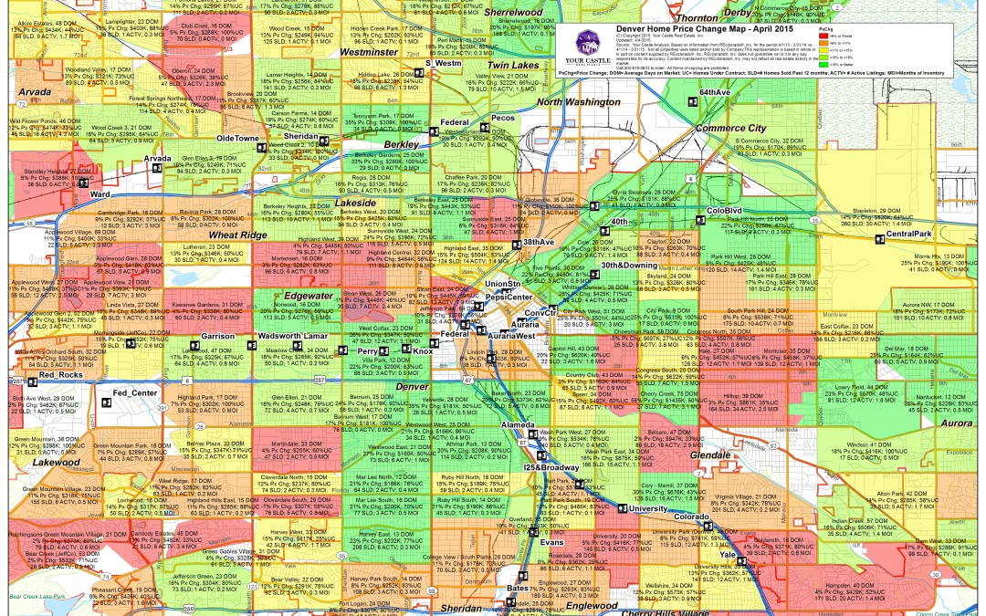
by aaron@inhabitdenver.com | May 11, 2015 | Uncategorized
For more information on how to interpret this map and what I think the trends show for the future, just give me a call at 303-506-6786 or shoot me an email at aaron@inhabitdenver.com. Click on image to view at full size and zoom in to see specific neighborhood data. Key to Abbreviations: PX Chg=% Price Change, DOM=Days on Market, UC=Under Contract, SLD=Number Sold this Quarter, ACTV= Number of homes currently For Sale and not under contract, MOI=Number of Months of Current Inventory based on Current Sale Rates. ...